Background
If you’ve used SHAP before, you know that it does some things well, and others, not so much: while it’s good for quickly estimating global feature importances, and getting a glimpse into feature value-influence relationships, interacting with the results is limited to what can be done in a notebook.
- Visualization options are limited,
- charts are static / not interactive, and
- the concept of a comparison, whether of multiple models, or across your data’s time periods of interest, is non-existent.
These limitations hamper SHAP’s utility in ML Observability frameworks, e.g., to expedite model development and validation activities, or to investigate production issues compared to a known good baseline.
The good news is that using modern ML Observability tools just got a whole lot easier! Enter TruSHAP.
TruEra’s best-in-class ML observability & debugging
If you haven’t heard of TruEra before, our company provides best-in-class ML observability services for testing, explaining, and debugging machine learning models, pre- and post-production.
TruEra has its own explainability engine that is optimized for performance and accuracy. In fact, the method our co-founders developed to estimate Shapley values predates OSS SHAP. However, SHAP is a popular open source option for doing so, and we are excited to simplify the on-ramp to a better user experience and more actionable results, by providing this integration.
TruSHAP: making your transition a no-brainer
In my colleague’s recent blog post, he lays out how existing SHAP users can use our TruSHAP extension to supercharge their explainability results: with two simple changes to existing SHAP code, users can automatically ingest data and SHAP-based feature influences into a TruEra project. The result? A massively expanded set of observability results with minimal effort!
Our ML observability dashboards are comprehensive, including many missing features in OSS SHAP:
- Automated model error analysis & explanations, thereof
- Model Comparison
- Drift root cause analysis
- Segmentation on inputs, outputs (predictions), and arbitrary row-level extra data
- Fairness root cause analysis
- Flexible consumption of results for all stakeholders, code-first, or not:
- Model owners & business stakeholders can quickly customize and observe observability dashboards, and
- Developers can use the web application’s Interactive visualizations to go deep in their analyses, finding hard-to-find “data needles” in the haystack, faster.
Getting started with TruSHAP
So, how do you get started? With our new TruSHAP extension, it’s easy:
- Import TruSHAP from TruEra library, as SHAP
- Use native SHAP methods
- Add a few extra parameters to your SHAP methods, to automatically create new TruEra projects and produce observability dashboards
Let’s look at an example!
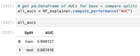
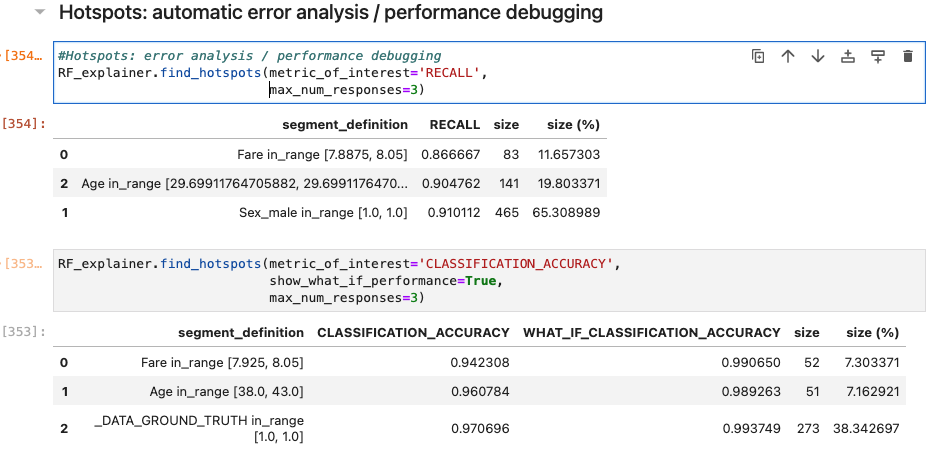
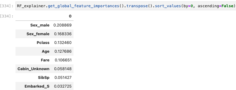
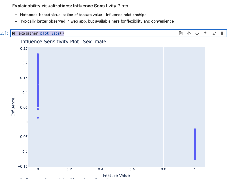
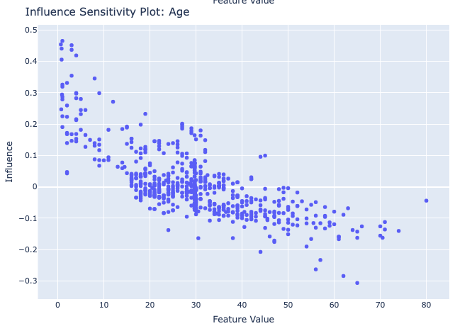
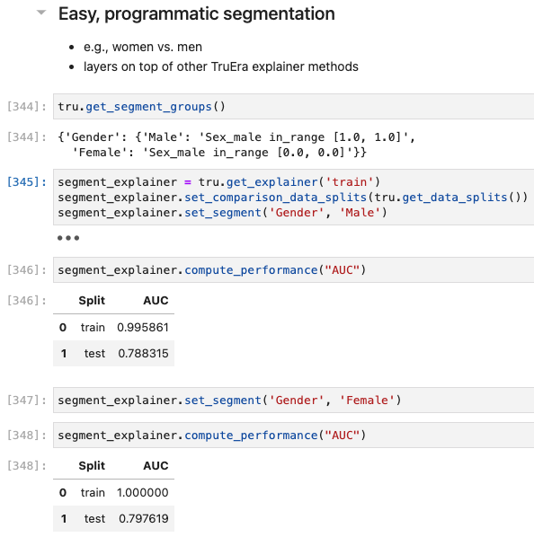
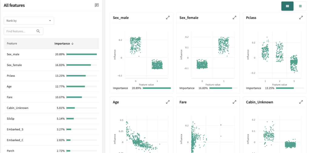
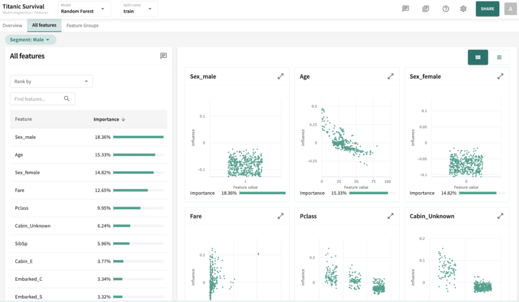
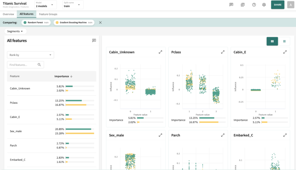
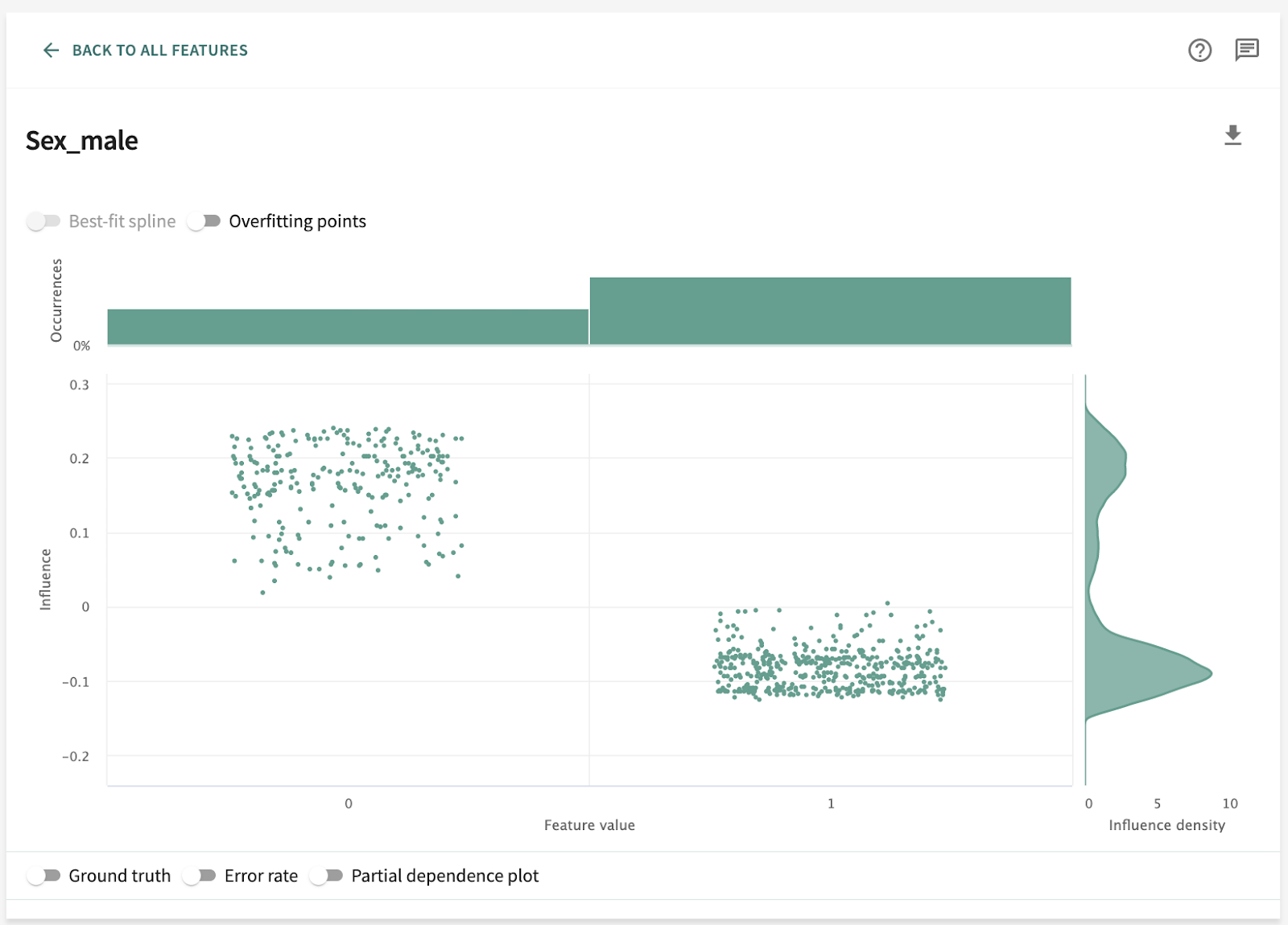
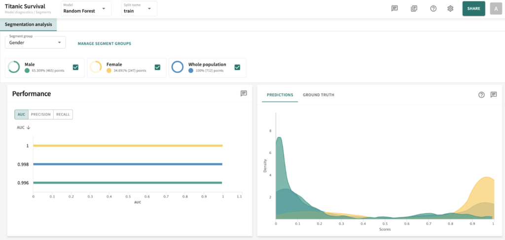
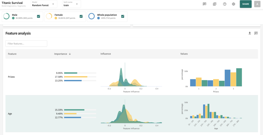
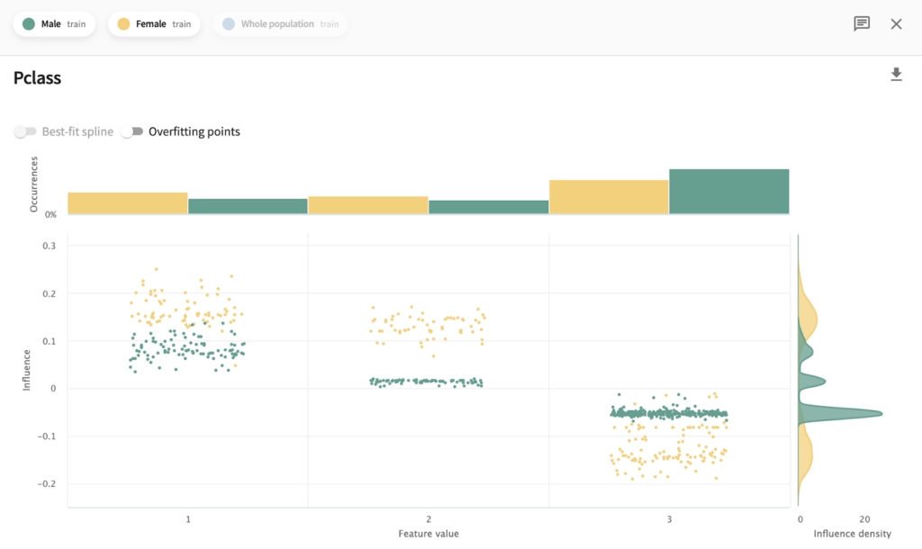
I’ve chosen the titanic dataset to demonstrate TruSHAP, because it is well documented, and relatively clean. We’ll skip the data prep and modeling details for the purpose of this blog, but you are welcome to take a look at those details in the end-to-end notebook, which is available Approach 1: Using native SHAP methods Here, I load SHAP and create a few explainer objects from the models I’ve trained and am holding in memory. Then, I generate Shapley values for one of the models, and use SHAP’s summary plot feature to generate a visualization of feature influences, per feature. Personally, I find these summary plots hard to interpret: Also, the violin-plot approach to representing influence density can be difficult to interpret, especially at the (static) low-resolution levels of Matplotlib. Speaking of these results, specifically, all I can really glean from this plot are: There is also some evidence that some of the categorical features (which are all represented as binary options, in the prepared data) have a wide variety of influence when they are “present” or active (e.g., Cabin_D or Embarked_Q). But it’s difficult to go deeper than that, with this tool. Let’s extend SHAP methods using truSHAP, providing an easy on-ramp for your existing SHAP code to produce TruEra Diagnostics’ observability metrics. All you need to do to unlock TruEra Diagnostics insights from your SHAP script is to do the following: Then, just as before, we can use the SHAP explainer object we’ve created to generate shapley values.. And now, for the magic trick! Just by executing the TruSHAP explainer object against data of interest, we not only generate the Shapley values as before, but have populated our project with the data, predictions, and feature influences, without further action! Resulting project: https://app.truera.net/home/p/TruSHAP%20-%20Titanic%20Survival/t/projectOverview Review the Features page, it’s very easy to see an explainability summary AND the feature value – influence relationships, all in one place = Explainability metrics (and all others in the web app) can be filtered to segments of interest: Note that the ‘Male’ segment has been selected in the upper right hand corner of the product screen shot, below. This custom segmentation can be performed on one or more model features, on extra row-level data added alongside the model features, as well as on model scores/outputs. It’s also extremely easy to perform model comparison in TruEra Diagnostics. In the model selector on the top navigation bar, just select as many of your ingested models, as you’d like. Here, we compare average feature importances and feature value – influence relationships between a random forest and a gradient boosting machine. When you’d like to dive deep into feature-specific behavior, TruEra has you covered. Inspecting feature value – influence relationships more closely is easy and intuitive with our Influence Sensitivity Plots. Earlier, you saw how we can easily focus TruEra’s explainability results on a specific segment of interest. But, TruEra also provides a distinct set of features to analyze and compare model behavior on two or more segments, at once. For example, we can observe comparative behavior of our Random Forest model with respect to gender. For example, what factors contribute to women being much more likely to survive? In the segmentation page, observe feature imprtance — we notice that Pclass, the type of ticket puchased, is far more important of a feature, on average, for women than it is for men. Can we tell why? Using the Pclass influence sensitivity plot, segmented on gender, we notice something interesting: This is just a small sample of the type of ML observability insights that TruEra’s web app can expose for model developers and production owners. For example, we have not touched on the ability to perform rapid root cause analysis of drift based on analyses of shifts in feature influences: this is a game changer from the “guess and check” approach based on feature value drift that is still, somewhat strangely, an industry standard practice. We also have not touched on the ability to perform fairness analyses on protected groups, using a similar feature-level distributional analysis of influences between selected segments representing such groups. We’ve also omitted TruEra’s automated model testing & performance evaluation capabilities, for brevity. To round out this demonstration, let’s return to a notebook – there, we’ll use TruEra explainers to perform similarly flexible analyses of model performance and behavior in a code-first manner. By now, you’ve seen the breadth and depth of ML Observability that TruEra Diagnostics’ web app can provide. But, what if you prefer to do these types of analyses in a code-first manner? The TruEra Python SDK’s model explainer capabilities have you covered. Performance Analysis & error hotspots TruEra supports a wide variety of performance metrics out of the box. You can also review the drift & fairness metrics that we support out of the box, in our public documentation. TruEra uses the context of your truera workspace to generate model-specific performance metrics with as little code and custom parameterization as possible. For example: TruEra’s unique methods of identifying high error segments (hotspots) is available in the web application or via the Python SDK. It highlights feature value ranges that are driving elevated error rates, and displays associated feature importances across the model schema, exposing novel feature interactions contributing to performance issues. Explainability You can also easily recall row-level and summarized explainability metrics. Note that our results are returned in standard dataframes, for further manipulation and customization of results, as needed. We can also plot the relationships between feature values and feature influences, with a single line of code. These visualizations make understanding these relationships far easier than what is available from open source SHAP (e.g., via summary_plot()) Drift As discussed previously, TruEra enables root cause analysis of score drift or error drift based on changes in a models’ feature influence distributions. This saves time during model development (e.g., to understand overfitting) and in production (to recognize which features are contributing to real world changes in model behavior). One can select the drift metric using the distance_metrics parameter, or the default metric as configured in your TruEra project will be used. Segmentation All of these capabiltiies can be augmented with custom segmentation. For example, let’s take a look at the model’s performance on Women, versus the entire test set. Summarizing all of this .. and a call to action SHAP is a very popular tool for model explainability, but it has many technical limitations, both in implementation, and in the quality (and interepretability) of its results. TruEra has spent countless man hours designing and implementing best-in-class ML observability services, focusing on scalable performance, extensibility, and user experience. Now, with TruSHAP, you can get the benefits of TruEra’s services with minimal code changes to your existing use of SHAP. Try it now on https://app.truera.net!
Approach 2: Now, let’s try this same process with TruSHAP!
Now we can visit the TruEra project and explore our model’s behavior.
Now, let’s use some of these features to interpret our survivorship model.
TruEra’s Python SDK explainer methods extend code-first ML Observability to new depths